Simple launches new look, redefining its premium skincare range
Simple launches new look, redefining its premium skincare range
Simple, the globally recognised skincare brand known for its uncomplicated and sensitive‑skin friendly formulations, has unveiled a fresh brand identity aimed at elevating its premium Active Skin Barrier Care range. This comprehensive redesign is rolling out now in the UK and will be introduced in international markets later this year.
The global refresh, developed in partnership with international branding and design consultancy Lonsdale, is designed to create clearer visual distinction between Simple’s core range and its advanced performance line. The update aims to reinforce the brand’s reputation for effective, ingredient‑led skincare while retaining the authenticity and accessibility that has defined Simple for decades.
A Modern Identity for a New Skincare Era
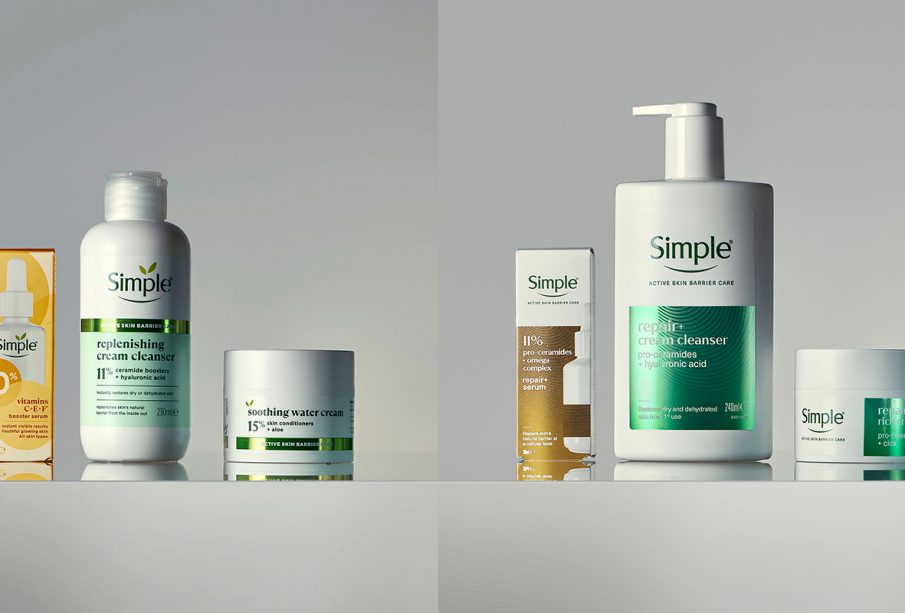
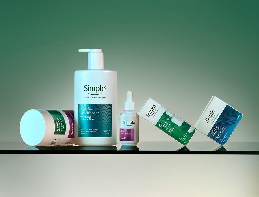
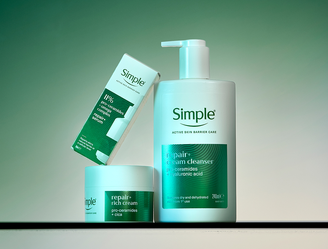
Simple’s Active Skin Barrier Care collection was created to address a broader spectrum of skin concerns, focusing on cellular‑level repair and prevention. However, until now the packaging design closely resembled the core range, making it difficult for consumers to immediately recognise its advanced performance positioning. The new identity remedies this by visually emphasising efficacy and scientific credibility without sacrificing simplicity.
As part of the redesign:
-
The classic Simple wordmark has been refined by removing the iconic leaf motif above the logotype – sharpening focus on the trusted brand name.
-
The Active Skin Barrier Care line now uses hierarchy and purposeful restraint in its design, helping consumers better understand product benefits.
-
A refreshed palette combines Simple’s signature green and white with metallic gradient tones, evolving the brand into a more premium and modern aesthetic.
-
Packaging incorporates textural patterns inspired by skin contour and layered printing techniques that signal both technology and tactility.
These changes aim to make the range easier to navigate and more educational, especially for younger consumers like Gen Alpha, who are showing increased interest in skincare that balances efficacy with transparency.
Balancing Science With Simplicity
Despite the visual upgrade, the brand’s core promise remains intact: uncomplicated, effective skincare that respects sensitive skin and avoids unnecessary clutter. The new design language bridges science and sensitivity communicating performance while maintaining the approachable tone long associated with Simple.
Michelle Mak, Creative Director at Lonsdale, explained the philosophy behind the refresh, noting that “being simple isn’t boring or basic it’s actually confident.” She emphasised that the updated branding allows Simple to “bring a more expert, premium feel” while still delivering on clear benefits and an accessible look.
What This Means for Consumers and the Market
The relaunch represents Simple’s effort to premiumise its skincare offering in a market crowded with high‑tech brands and complex routines. By elevating the Active Skin Barrier Care sub‑range, Simple aims to compete not just on gentle formulations but also on dermatological credibility and modern design appeal.
The updated products are already arriving in retail outlets across the UK, with a global rollout planned throughout 2026. This strategic refresh positions Simple to attract both loyal users and new consumers seeking effective skincare solutions with a trusted heritage.

Leave a reply


 Fun times ahead … #lebronjames #lakers #lebron #lustremagazine00:19
 Oscar-winning #MichaelBJordan Congratulations!! #Sinners for winning Best Actor at the 2026 #Oscars00:56
 #Zendaya publicly shared “recovery plan” and its brilliantly low-effort #lustremagazine00:16
 #NickJonas is smooth 😍 #PriyankaChopra #couple00:10
 #AnnaWintour and #MirandaPriestly at the 2026 #Oscars00:14
 #tchalamet and @kyliejenner make their way into the #VFOscars party. Video by wengellg00:06
 #Oscar winner and #Sinners star #MichaelBJordan00:38
 #ElsaPataky #ChrisHemsworth #Oscars #celebritycouple #Oscars202600:08
 #tyla attends the #maisonvalentino AW26 show in Rome #DazedFashionTV #Valentino00:12
 Garmmy 2026 #justinbieber #hailybieber #grammy #lilbieber #lustremagazine00:29
 #zendaya understood the assignment. #tomholland #viral #trend #celebrity00:11
 #LeonardoDiCaprio has graced the #BAFTAs with a rare red-carpet appearance, wearing a #dior00:21
 #annehathaway at the #Balenciaga fashion show 2026 #ParisFashion Week on #thedevilwearsprada00:14
 #Ponytail is back! #ArianaGrande looks gorgeous at the 2026 🎥: ginainterrupted #GoldenGlobes.00:20
 #SHAQ forgot that he bought two Escalades 😅01:14
 #therock and #KevinHart doing the #TortillaChallenge is the funniest thing we’ve seen all week!01:00
 #Oscar Throwbacks, #EmmaStone accepting her second Academy Award (in a broken dress!)01:41
 #Bridgerton cast and crew singing ‘Happy Birthday’ for #Yerin #bridgertonseason400:16
 Inside #queencharlotte wig #bridgerton #bridgertonseason400:08
 #zendaya at the #louisvuitton AW26 #lustremagazine00:17
 #shaq on set for #gravesendseries #shaq #brooklyn #onset #basketball #gangster #epic00:13
 #zendaya dazzling in white at #louisvuitton’s fall/winter #ParisFashionWeek show #lustremagazine00:17
 #shaq #queenlatifah at a NBA playoffs game #shaquilleoneal #nbaplayoffs00:16
 #johnlithgow #albusdumbledore #harrypotter #celebrity00:12
 #sbiff awardees #jacobelordi #wagnermoura #teyanataylor #wunmimosaku #ingalilleaas #sydneysweeney00:07